Google/Fitbit
Fitbit Ace LTE
Fitbit Ace LTE is a connected smartwatch for kids with the goal of giving kids some independence without giving them a phone.
Communication was a big part of that.
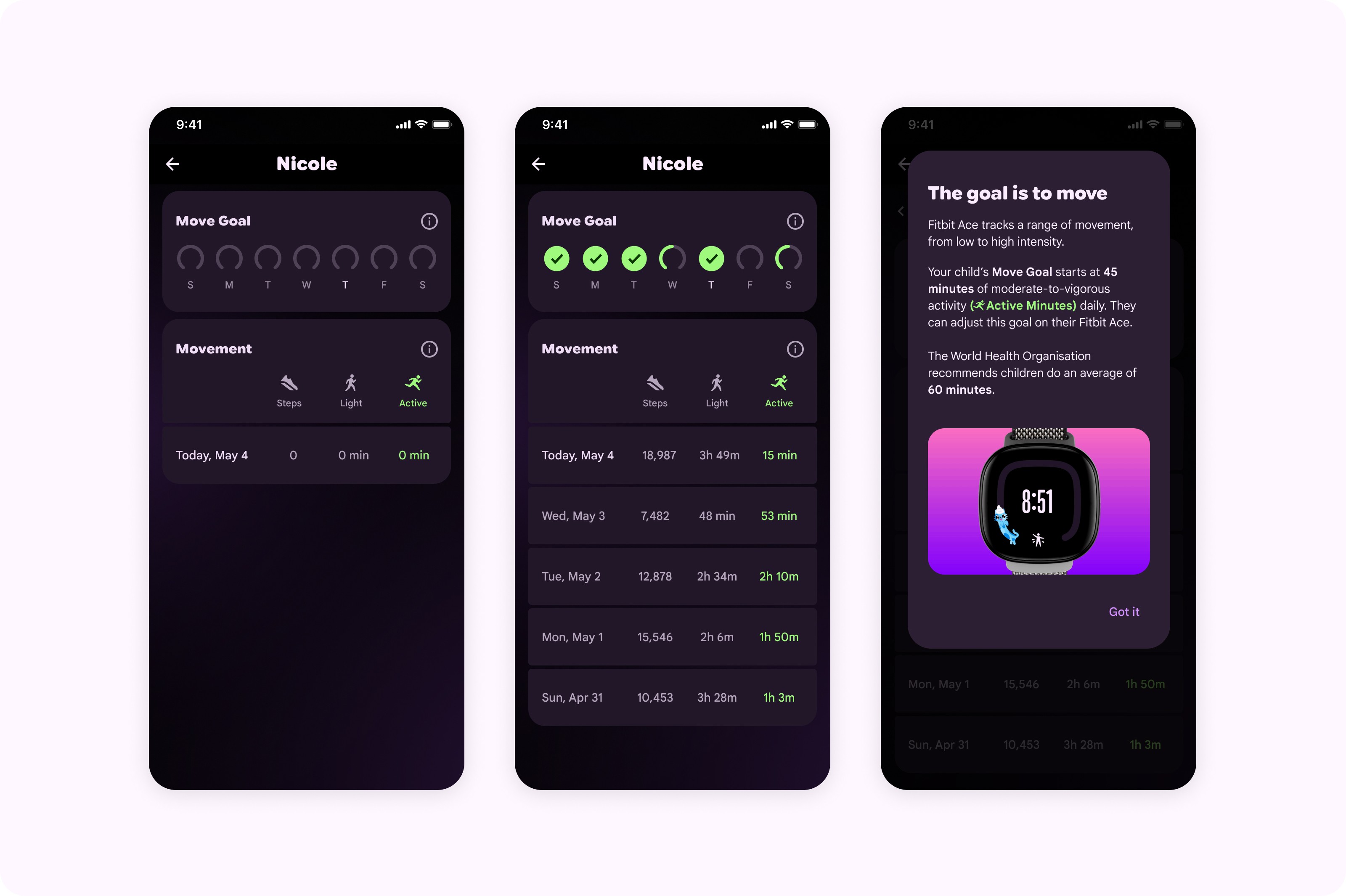
I was a UX designer on the Connections team, working on the parent facing app. My main areas were trusted contacts and communication, onboarding, and movement.
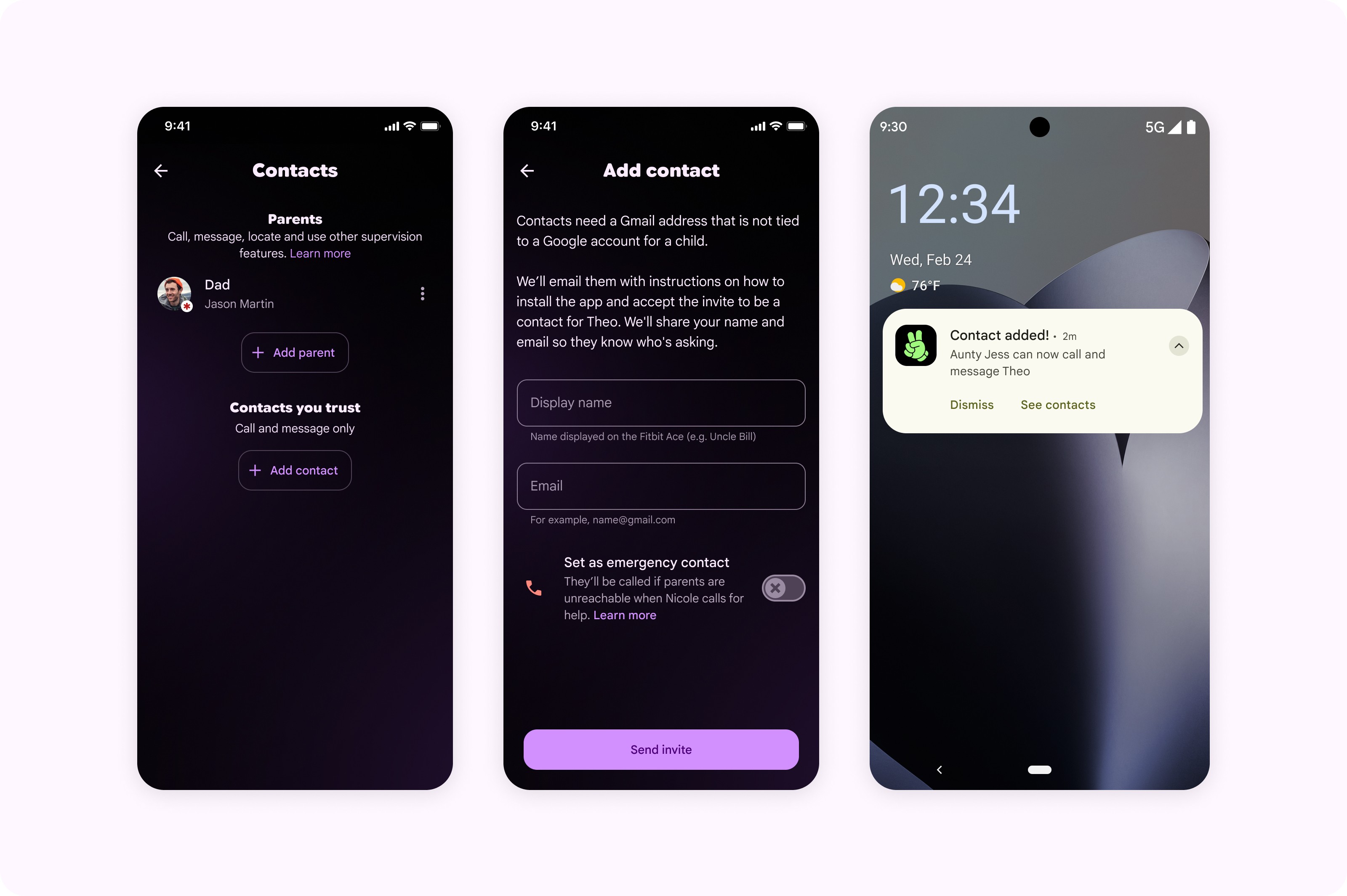
Deciding who can reach a child
Parents needed control over who could call or message their child, but not every person in the child’s circle should have the same access.
A trusted contact might be a grandparent or family friend. They needed permission to call and message the child, but no control over the account itself. A second parent was different: adding them gave them the same access as the parent who added them.
I worked on the flows for adding both. Trusted contacts were invited rather than simply added, so they had to accept before they could contact the child. Second parents were shown what access they were getting before accepting the invitation.
Setting up an emergency contact wasn’t enough
After launch, research surfaced a more worrying problem. Parents had successfully set up an emergency contact, but some couldn’t explain what would actually happen if their child needed to use it.
The setting worked, but parents didn’t necessarily understand the system behind it.
I redesigned this part of the experience to explain what the emergency contact does, how a child triggers it from the watch, and the physical button interaction involved.
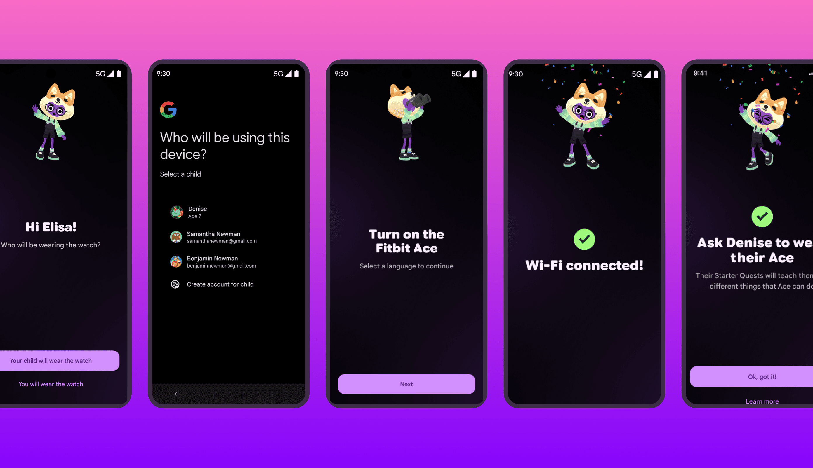
Making onboarding work across two systems
Setup crossed between the Ace experience and Google owned screens for things like payments, subscriptions and privacy. The shifts in branding were noticeable, and our team didn’t control every part of the journey.
Rather than trying to make everything look like Ace, I focused on the parts we could make more coherent. We aligned our screens more closely by using dark mode, while keeping Google branding where it helped make the change in context clear, such as payments and Terms of Service.
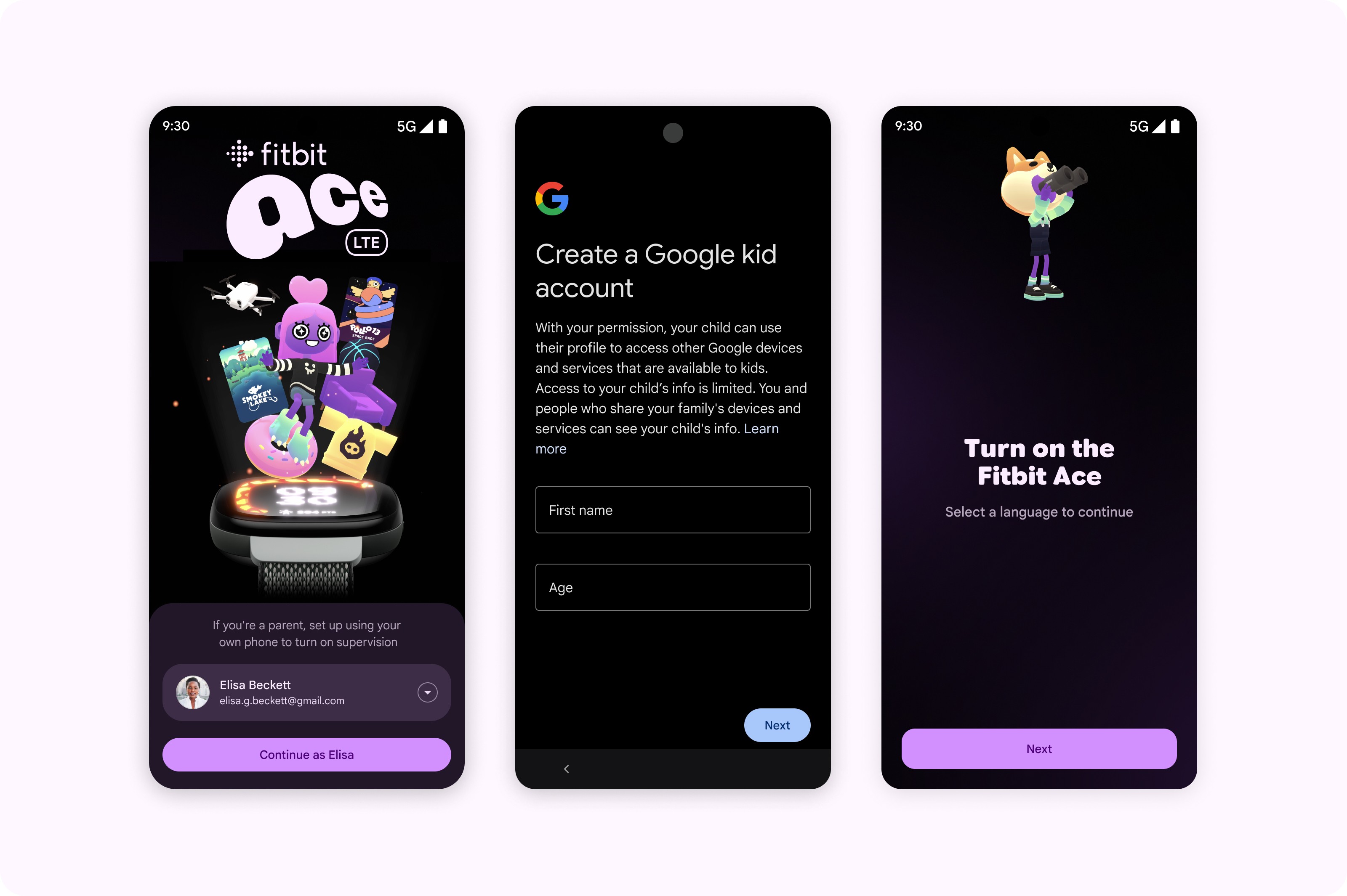
Replacing a progress counter we couldn’t stand behind
The progress counter was another problem. It suggested we knew exactly how far through setup someone was, when the journey could branch into steps we didn’t control. I removed it rather than show progress we couldn’t represent accurately, and used smaller completion states such as “Done!” between stages instead.
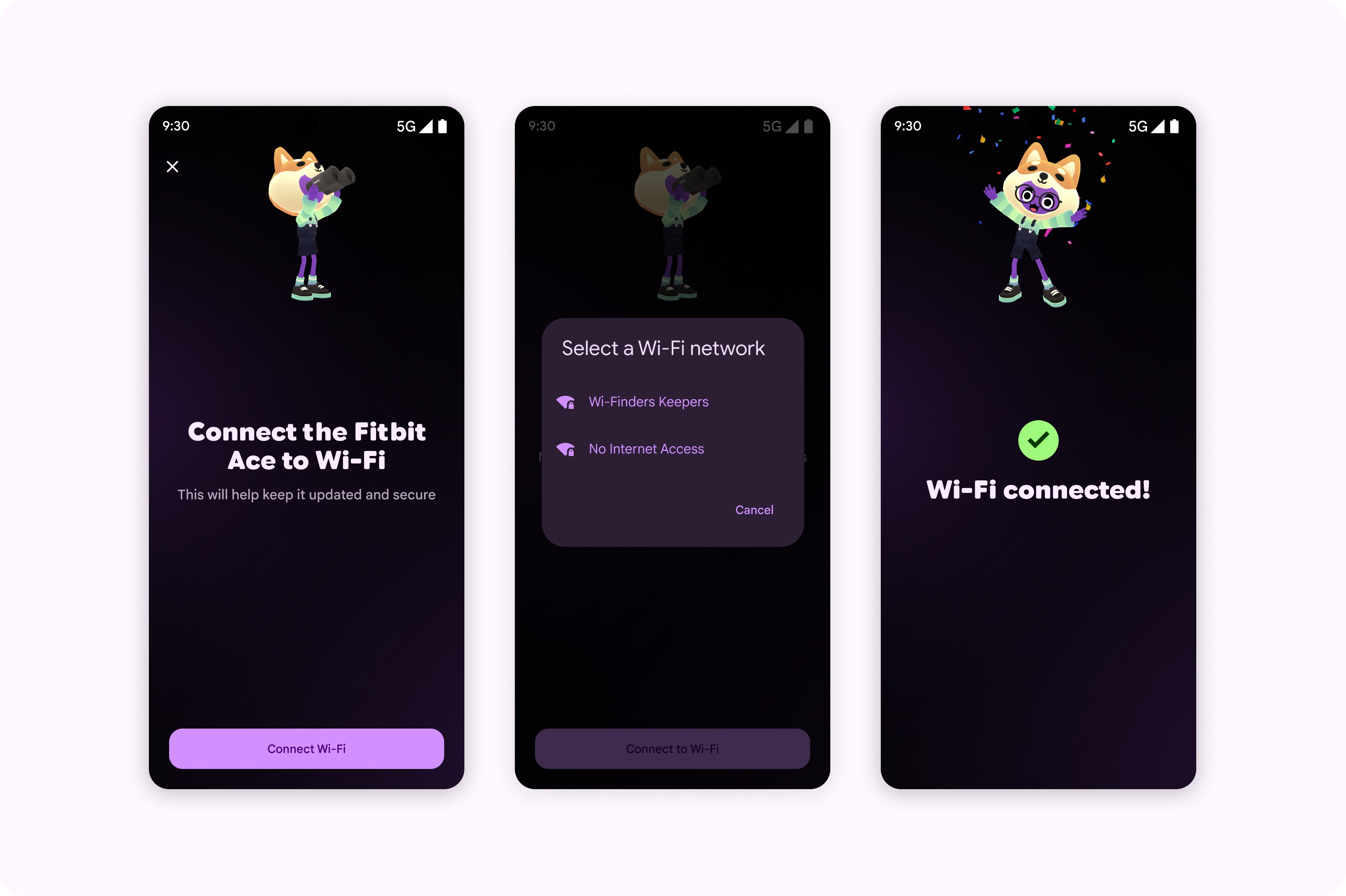
Designing for when setup didn’t go to plan
The other gap was what happened when setup didn’t go to plan. Wi-Fi could drop. Bluetooth pairing could fail. A parent could simply need to stop halfway through.
I worked closely with Engineering to map those exits and failure states and designed recovery paths around them, including being upfront when leaving setup meant starting again.
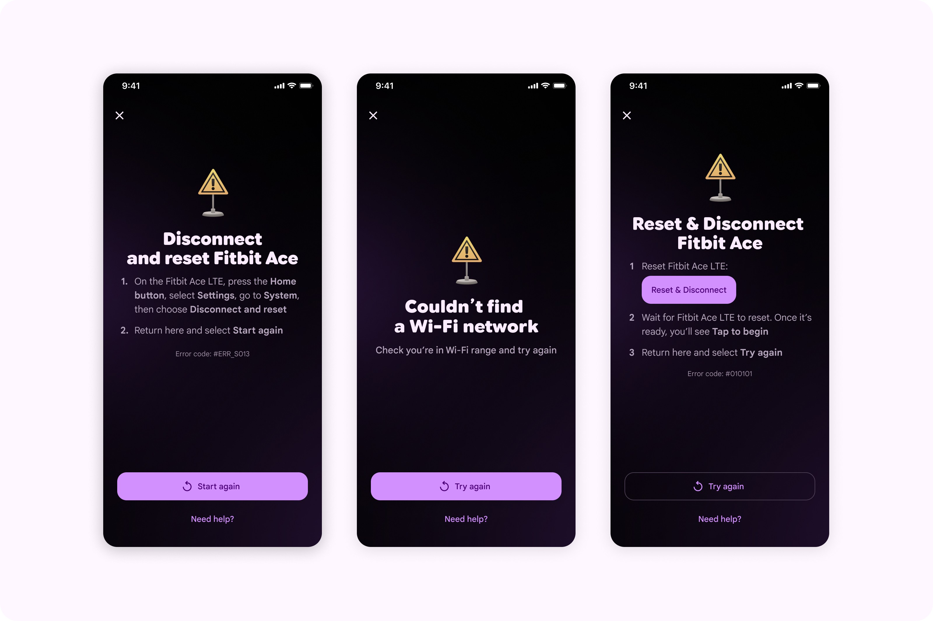
In usability testing, parents completed setup successfully and perceived it as faster than the earlier experience. They generally described it as straightforward.
Pushing activity beyond a step count
The original scope for the parent activity view was basically a step count and the daily move goal. I pushed to expand the scope to include progress towards adding a distinction between light and active minutes.
It took some advocacy to get the additional information into scope, but it shipped as part of the parent experience.